Accessible Excel Spreadsheets
Note: Excel, Word, and PowerPoint files should not be uploaded to Terminalfour. Instead, copy and paste the content into a Google Sheet or upload the file to the Shared Drive under a corporate email account (not a personal work email). You can then link to the document.
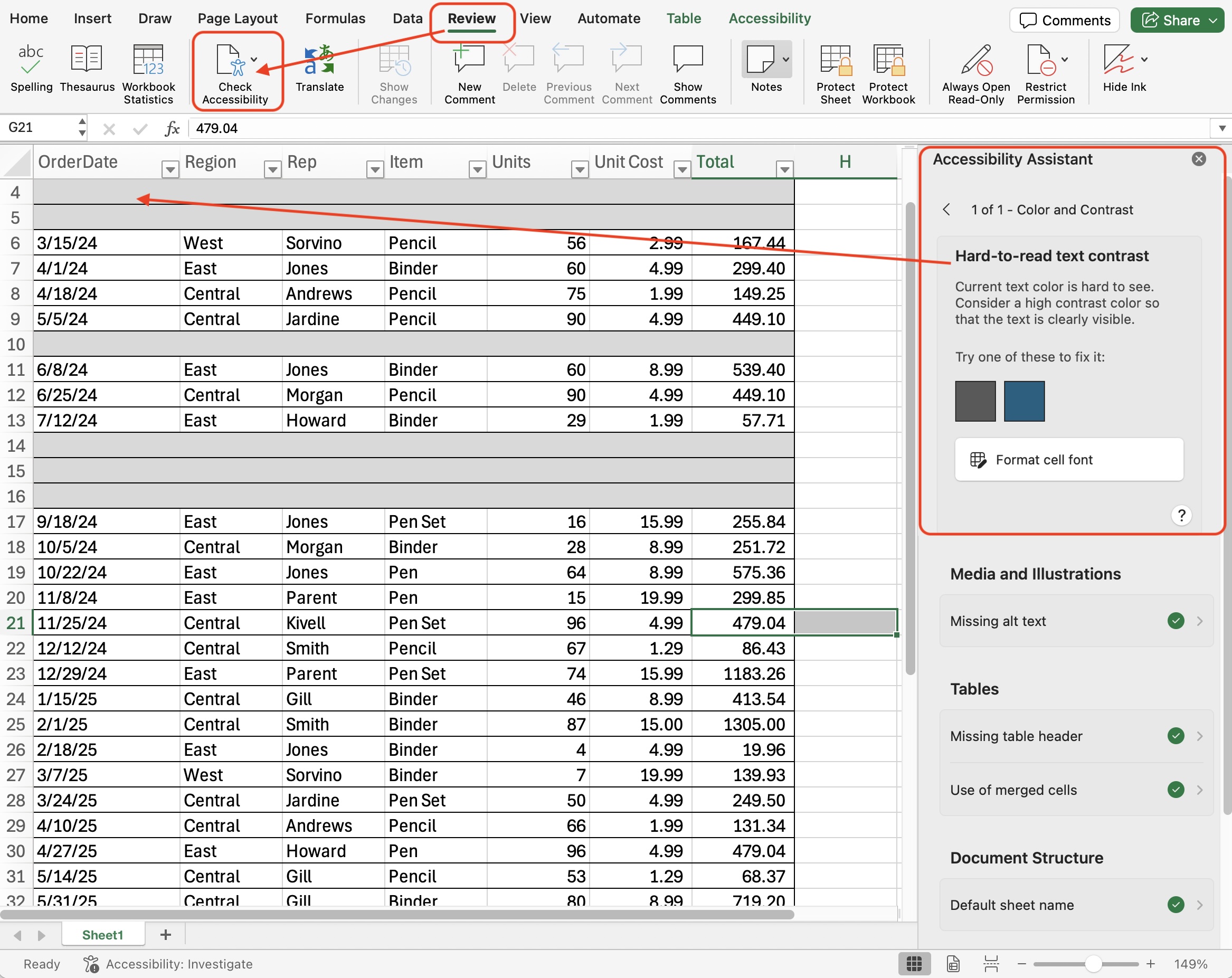
The contrast between the color of the text and the background it is overlaid on should be at least 7:1 for normal text and 4.5:1 on large text. Color contrast issues are pinged in accessibility reports.
It is important to avoid white text on a white background because it will fail in the contrast ratio area.
Excel has an Accessibility Checker under the Review tab.
Assistive technologies will be able to navigate Excel documents natively. Screenreaders can be used to hear how documents are scanned.
- Do not change the color of text to hide it on a white background.
- On Mac, you can test using the VoiceOver screen reader tool.
- On Windows, you can test using Narrator or an external tool like JAWS.
Learn more about Accessible Accessible Styling and How to Make Your Site Accessible.