Digital Signage Best Practices
Please familiarize yourself with the following guidelines for creating an effective message for Fordham University’s digital signage system.
Digital Signage Governance provides specifications for the configuration of digital signage hardware and the management, design, and dissemination of digital signage content at Fordham University.
Submit your message via this form
For questions about creating a message and anything else about digital signage, contact [email protected].
Dimensions
Submit 2 versions of your message slide to accommodate both portrait and landscape screens.
Screen aspect ratio: 9:16 and 16:9
File dimensions:
- Portrait: 900 x 1600 pixels
- Landscape: 1600 x 900 pixels
File formats
- PNG or JPG format (1MB maximum file size)
- Submit 2 files, one each for portrait and landscape orientations
Text
Keep your message simple and use efficient phrasing. When planning out your message, think of it as a billboard. Messages will show for approximately 7 seconds.
Include the following information, but be mindful of their order and the visual weight you give to each:
- Host/Sponsor
- Event name and image
- Date
- Time
- Location (physical or virtual).
- QR code
Below, note how the Fordham logo and department name are indicated at the top as part of the event’s details. But the most important information—the event title and the speaker or subject—is emphasized in the center of the sign with the largest type, followed by the secondary information: date, time and registration details.
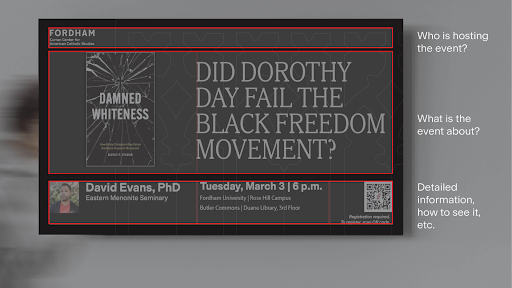
Less is more.
Use the 3 by 5 rule: No more than 3 lines of text with 5 words each
OR 5 lines of text with 3 words each
Always proofread and double check your text!
Fonts
- Use one of these sans serif typefaces: Arial, Roboto, or Verdana
- Use bold only to emphasize important information
- Avoid italics (sans serif italic is visually weaker, less legible than regular or bold)
Recommended text sizes in applications used to generate slides:
Adobe Apps (InDesign, Illustrator, Photoshop)
180 point maximum / 60 point minimum
(see TechHelpBee examples)
Microsoft Apps (Word, Powerpoint)
100 point maximum / 36 point minimum
Google Apps (Docs, Slides)
100 point maximum / 36 point minimum
Colors
For optimal legibility (readability), use a white or light-colored background and dark colors for text. Restricted colors
- Shades of red or purple that compete with Fordham maroon (#7e072a)
QR Codes
QR Codes allow viewers to scan a code for more details. If you need one made, contact [email protected]u.
Images and Video
- Use images with a minimum resolution of 72 ppi.
- Videos should be no longer than 20 seconds in length. Campus screens cannot play audio.
- Use copyrighted images ONLY WITH consent. See section VII.C.o in the Governance document.
- If images/videos include individuals, you must have those individuals’ consent before using them in public. See section VII.C.p in the Governance document.
- Video must be closed captioned.
- If you need assistance finding and using appropriate imagery, please contact Marketing and Communications ([email protected])
- Using multiple images and graphics on one slide can cloud your message. Usually one image delivers the most impact.
Use of Fordham Seal and Logo
- Do not use the Fordham seal
- If your message is using a Fordham logo, please visit the brand standard site to ensure you are using the correct version.